HUGS FOOD PANTRY OF THURSTON COUNTY
- Logo
HUGS - Food Pantry of Thurston County is a food and toiletries delivery service for trans and non-binary people. Please visit their website to learn more about their work!
WOMEN IN GAMING (ArenaNet)
- Logo
- Wearable / Merchandise Design
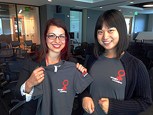 Women In Gaming is a growing internal community within the video game development industry started by
members of ArenaNet centered around the topics and experiences women developers share.
Women In Gaming is a growing internal community within the video game development industry started by
members of ArenaNet centered around the topics and experiences women developers share.
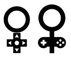
While I was also employed as a 3D artist at ArenaNet, they asked me to design a logo that would effectively communicate the subject and identity of the Women In Gaming group, and that it has to be easy to print onto swags.
With only about two weeks to work with, I was able to meet their needs with a logo based on familiar iconography associated with video games (with the Directional-pad buttons on a controller) and the universal symbolism of womenhood.
The use of color is restricted to two or less to ensure affordabile screen printing, and because the group wants to ensure brand association with ArenaNet, sporting the same red color as their own company logo was an obvious and effective choice. There were several other drafts of the logo but the silhouette mostly remained identical to the end result as the simple visual effectiveness was very well received. Especially at large industry conventions where attendance is staggeringly huge, these Women In Gaming branded shirts were able to boost the cleint group's visibility.
DERIVATIVE PLUS
- Logo
- Branding
- Limited Animation
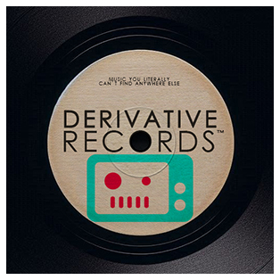 Derivative Plus is an innovative platform that leverages AI-generated content to create a unique, satirical
streaming experience. I was commissioned to design their logo, develop their brand identity, and contribute to the
development of a fully functional website. Using Next.js, a robust React framework, I played a key role in delivering
a high-performance web application tailored to their creative vision. By seamlessly blending bold, whimsical colors
and tone with a visual layout inspired by major streaming platforms, the result is a humorous yet immersive interactive
environment that feels both engaging and familiar.
Derivative Plus is an innovative platform that leverages AI-generated content to create a unique, satirical
streaming experience. I was commissioned to design their logo, develop their brand identity, and contribute to the
development of a fully functional website. Using Next.js, a robust React framework, I played a key role in delivering
a high-performance web application tailored to their creative vision. By seamlessly blending bold, whimsical colors
and tone with a visual layout inspired by major streaming platforms, the result is a humorous yet immersive interactive
environment that feels both engaging and familiar.
TRANS RESOURCE & REFERRAL GUIDE
- Posters / Brochure
Seattle King County's Office of Civil Rights contacted me through my work with Gender Justice League and asked that I create a full page design that serves as an alternative cover for their 2014 edition of the Trans Resource and Referral Guide booklet.
The work itself is a visual collage of a rainbow colored unicorn with a symbol of a key overlayed on top. The key itself is styled after the traditional symbol of gender nonconformity, and itself fashioned into a tiling background pattern. Then I overlayed a high resolution Hubble space telescope photo of the cosmos for a dazzling effect (Thanks wiki commons!).
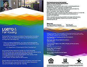
The client then asked if I could also help design a LGBTQ focused informational rack card for their
Fair Housing department, which I was able to create with some assistance with members of Gender Justice
League (Thanks Gender Justice League!).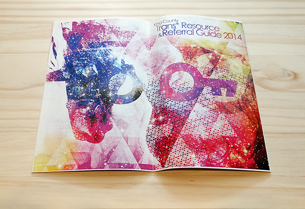
GENDER JUSTICE LEAGUE
- Logo
- Branding / Stationery Design
- Wearable / Merchandise Design
- Posters / Brochure / Digital Announcements
Gender Justice League is one of the largest trans and gender diverse activist collective in the Washington State. The group is committed to fighting gender discrimination and creating safe communities for all people.
When the group was founded in 2012, I was priviledged to be included as their graphics designer and have been responsible for designing the group's visual brand identity since.
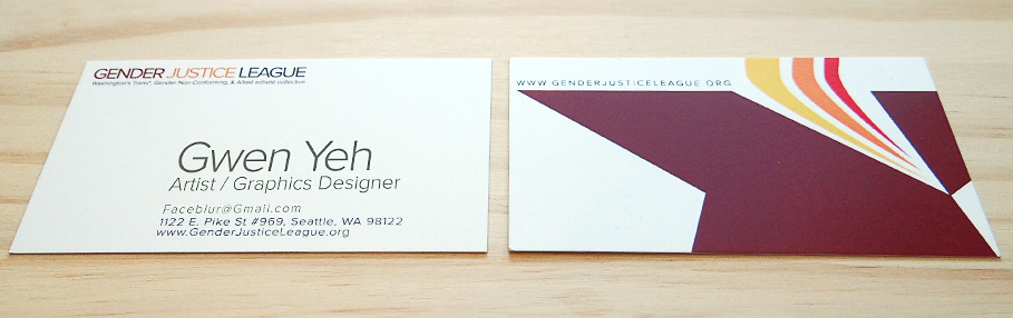
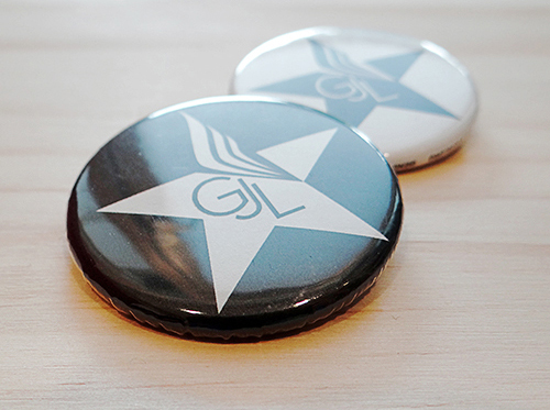
The star logo was first selected, after many early drafts were created during the first month, for it's representation of passion for grassroot justice. Then in the following month I took the design further, hand sketching several variations, and created what would become the final star logo that "carried" the flames of justice atop the star itself and with colors chosen for it's association with passion, energy, and fire. The logo's versatility lends itself on letterheads, name cards, stickers, posters, buttons, T-shirts and various other stationaries and merchandise.
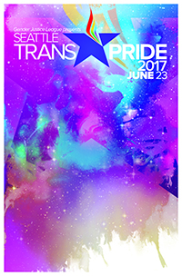
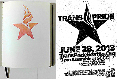
Additionally, one of the largest event that Gender Justice League organize every year since 2013 is the Seattle's Trans Pride Parade, attracting over 20 thousand attendees and growing. Every year since it's inception in 2013 I have been creating new posters to promote Trans Pride and with it came new challenges to the overall design of the brand. A slightly altered version of the logo was created to match the rainbow theme of Pride Month and the various swags and merchandise created for that specific event.
I am especially proud to have been fundamental in shaping the aesthetics and visual brand identity of one of the most important gender focused justice organization in the Washington State.
Please do be sure check out their website for more information about their imporant work!
50 CALIBER VODKA
- Logo
- Label Design
- Package Concept
 I was asked to actualize a design for a client's concept liquor based around a unique cup design they wished to integrate and a new logo that fit the edgy
style of the brand.
I was asked to actualize a design for a client's concept liquor based around a unique cup design they wished to integrate and a new logo that fit the edgy
style of the brand.
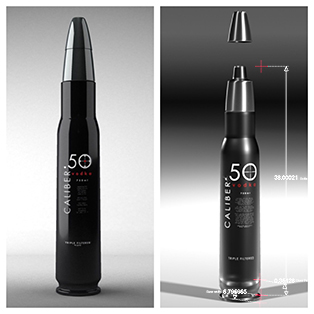
The logo itself was produced within a week, based around the Century Gothic typography for a modern style and an integrated crosshair to match the theme of the product.
Over the course of next two months, the design concept for the product itself went through almost 30 different iterations of client changes and requests, going through many differing proportions and configurations. The key component was the unique bottle tip that always housed a stainless steel premeasured shot cup and was central to the client's concept.
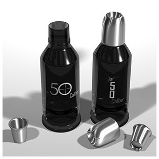
Using 3D rendering softwares I was able to quickly illustrate many of the client's concepts without having to rely on physical mockups. Based on these quick visual aid, the client was able to decide on the direction for the product and improve on their original concept.
The final result was of a much larger but also narrower design that and can integrate the shot cup itself as a bottle cap in a more streamlined fashion, and with the fully useable 3D model that I created, the client was able to specify the dimension of the bottle down to the milimeter, making product fabrication just slightly easier.
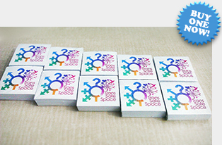
TRANS SAFE SPACE (Ingersoll Gender Center)
- Logo / Sticker Design
- Wearable / Merchandise Design
The Trans Safe Space project was started by participating members within the Ingersoll Gender Center community to help promote safe spaces for gender nonconforming people and engage the public in trans safety awareness. They needed a catchy logo to acompany the "Trans Safe Space" tag and a versatile way to attach the image in public areas. In addition the logo was also to be printed on swags and shirts.
The constraint was to create a logo that is completely different from the many other pink and purple logos that were commonly used by other cisgender LGB awareness campaigns. I was able to create the logo using a soft gradient mix of four different colors, focused on celebrating gender diversity in a fun, positive, and playful manner, something that deviates from themes of tragedy and seriousness more commonly used by the other awareness groups.
Then I helped set up the first of many bulk orders for the stickers and design a convenient online
shop for people who wish to purchase the sticker for themselves. Speaking of which, why don't you check out
the shop now and see if there's something you like?


Seattle based digital illustrator, graphic designer, & 3D artist.


